On the web today your site will be accessed from a variety of devices from smartphones through to widescreen displays.
Carbon is designed to look great at all sizes and we have minimised the footprint of the base theme for faster loading and rendering on mobile devices.
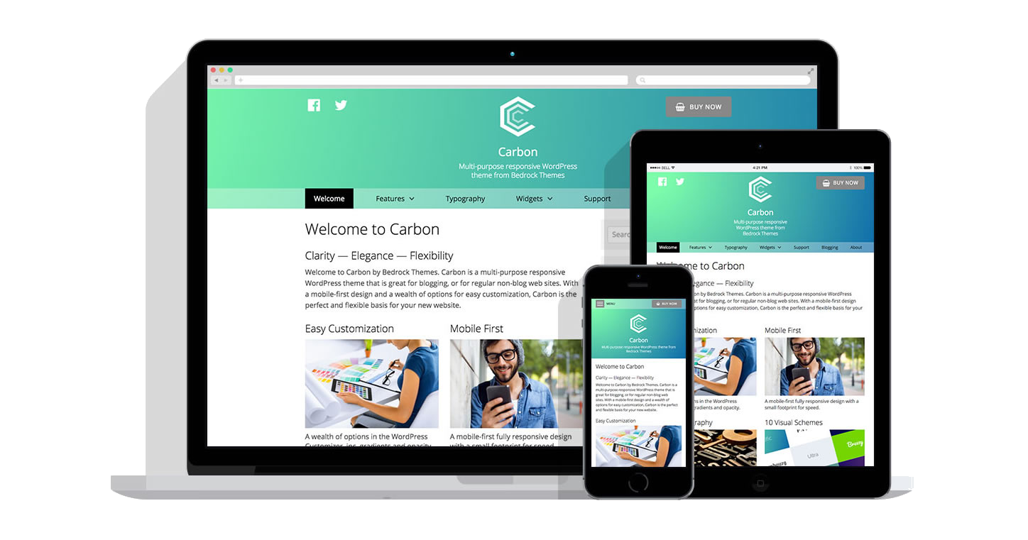
Three years ago it was likely that a third of your traffic came from users on mobile devices. A year ago that was probably more like 40% and today you a likely getting half or more of your traffic from mobile phones, iPads and tablets. We designed Carbon to look good and work well on every screen size designing the mobile view first and working back up to iPad and desktops.
Fully responsive
From a 4.5 inch smartphone display up to a 27 inch monitor, your site will look great running on Carbon. Our layout is fluid rather than having specific breakpoints. We give you control over the mobile menu; you can show a label, or hide one, have the menu button aligned to the left or the right, use a different menu for mobile devices than larger ones. Smaller, less network hungry featured images are delivered on mobile devices and all the drop down menus are tap-friendly for tablet users.
Small footprint
Ever see one of those “everything but the kitchen sink” themes? Ever look under the covers? Scary! Start light and add only what you need is our mantra.
We don’t include loads of stylesheets or Javascript libraries in the theme, with only a single stylesheet and absolutely minimal inline Javascript. Of course the plugins you add (like sliders for example) may include their own Javascript libraries but that is a tradeoff you can decide to make, or not. The option to go with browser defaults rather than loading web fonts gives you an extra option for really squashing page load times.